Over winter break, I went to Manhattan a couple of times, so I used the MTA website to look up train times. I felt that the mobile experience could be improved. As an exercise I redesigned the experience of looking up train times.
Problems with Mobile
- It isn’t responsive. I had to zoom in and move around the screen using my fingers.

- Choosing a station involved tedious scrolling. If I wanted to choose White Plains, for example, then I would have to scroll all the way down to ‘W’.
- Choosing a date involved the web browser to open a new window, leaving the previous screen.
- There is no indication on the screen that the station options are restricted to stations in certain train lines.
- Only relevant service status should be shown to the user. Why would the user care about the other service status of train lines that they cannot go to from their current station?
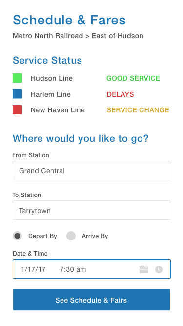
New Experience
After the user chooses East Hudson on this screen, they would get to this screen.
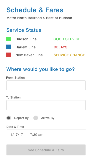
Larger font and responsive. Clearly indicates that stations are on the East side of the Hudson. Service Status only shows the lines on the East of Hudson.
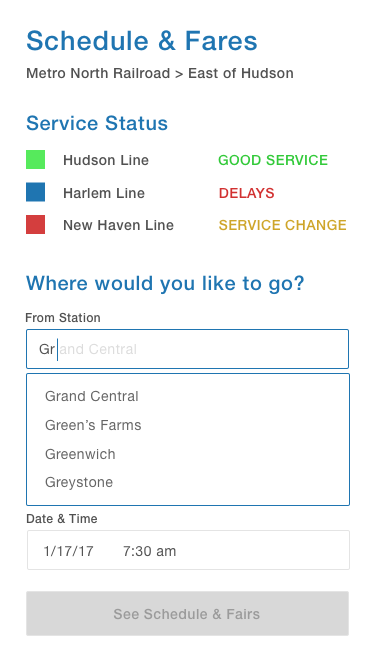
The user has the option to type in a station or scroll.
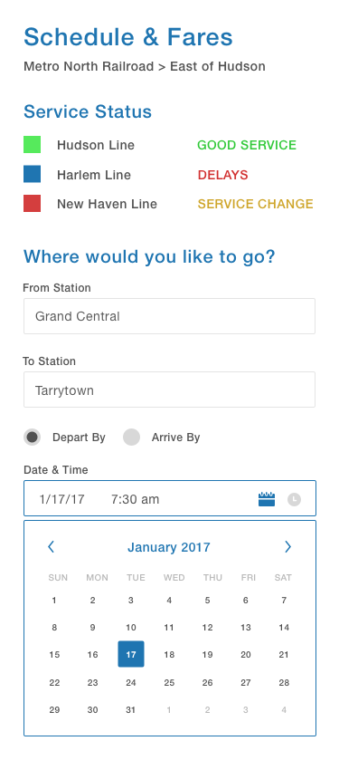
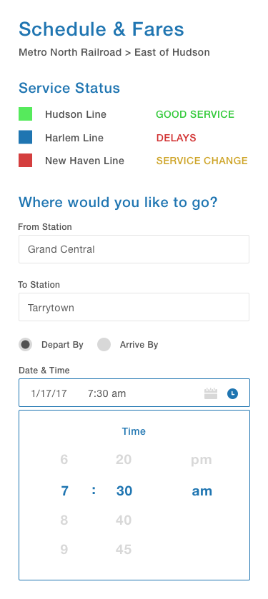
Choosing a date displays a visual UI of a calendar on the same screen. The user can toggle between date and time by tapping the appropriate icon on the right, or tapping the date/time itself.
Once all fields are filled, the See Schedule & Fares activates! I combined the See Schedule and Fares into one button because it’s convenient to see both pieces of information in one click.
Looking up train times is a small experience, but there were a lot of components within this experience that could be improved! Pretty neat.